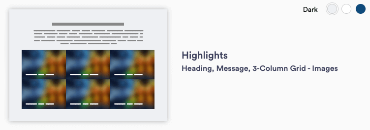
Highlights 3 supports a 3-column layout with headings and text. For Highlights sections, a range of items can be selected. Click the links below to view examples of how the items behave when a specific number of items are selected.
Highlights 3 (Primary H2) [Intro Container]
Behavior: 1 item - center and grow to occupy 2/3 of available space

Highlights 3 (Primary H2) [Intro Container]
Behavior: 2 items - share space 50/50


Highlights 3 (Primary H2) [Intro Container]
Behavior: 3 items - standard


Highlights 3 (Primary H2) [Intro Container]
Behavior: 4 or 8 items - 2-col


Highlights 3 (Primary H2) [Intro Container]
Behavior: 5 items - bottom row grows to occupy all available space


Highlights 3 (Primary H2) [Intro Container]
Behavior: 7 items - bottom row grows to occupy all available space


